Interchoice

The Brief before

The Brief

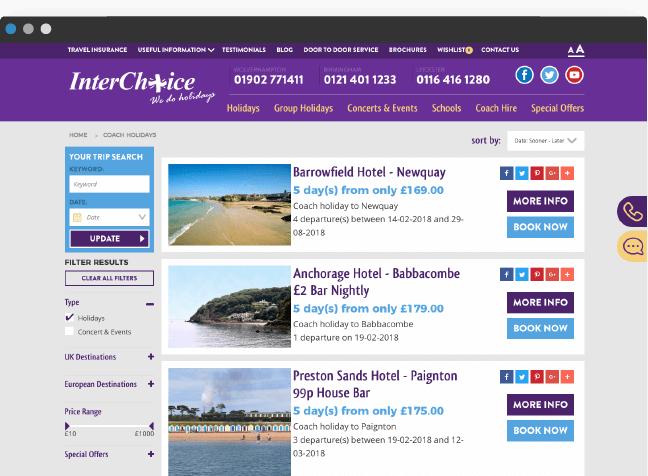
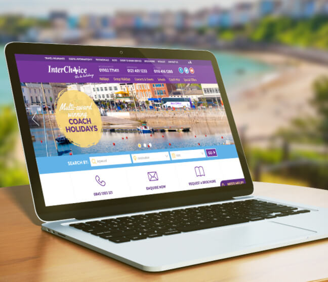
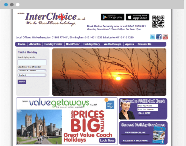
Initially we went for a sit down meeting with John at Interchoice Holidays, he explained that the website was a few years old and really needed refreshing.

After asking a few questions about the business, John told us his business was starting to change from a company that provided coach holidays to the over 55's and was starting to see a lot younger clientele using the service.

The brief was then decided that the new website would have a more modern feel but to make sure the site was extremely simple to use by all ages.

Get A Quote

The Approach

The approach was to put a plan together to give the site the modern and clean feel that John wanted but to make sure it was age friendly. 

Firstly we put a wireframe together to show John where all the elements of the site would be positioned, we made sure features like being able to adjust text sizes and having clear call to actions so if people did get stuck or was unsure they could always call for help.

With all elements decided after a couple of small tweaks Interchoice Holidays were ready to go into the design process.

Get A quote
The Approach
Grunge
Branding

Branding

The original Interchoice branding had been around for a good while so we knew doing a rebrand was out of the question so we went ahead and modernised the current brand.

The original brand identity had red, white and blue in the union jack and the colour of the font was a faded purple and just looked far to fussy and dated. 

We brought the brand right up to date by making it one colour and then repositioning the strap line so it sat well with the company name. The difference in the 2 logos is amazing, just by simplifying what was currently being used and adding a more modern colour really sets Interchoice off in a new direction and is much more attractive to the younger audience too.

Get A quote

Web Design

The difference between the old site and the new is just worlds apart. It really gives Interchoice more of a brand now that can be recognised easily.

As promised the look was clean and fresh and the information easy to find and digest and with simple touches like adjustable text it makes it easy for all demographics to use.

The holiday pages were all redesigned for ease of use, call to actions were carefully placed and an intuitive purchasing process really set the site off.

The guys at Interchoice were really impressed with the work and we have gone on to do other projects for people who were recommended to us by them.

Get A quote
The Web Design

Drop Us A Message

Have a project you are interested in speaking to us about? Send us your details, we’d love to get together, grab a cuppa and bounce some ideas around!

Please Select Service(s):
Grunge
Grunge
Grunge
Grunge
Grunge
Grunge